APEX Alert & Confirm Dialogs Deep Dive

Introduction
APEX 21.2 introduced several enhancements to APEX Confirmation and Alert Dialogs. These enhancements replace previous homegrown solutions that required Dynamic Actions and various APEX message JavaScript APIs.
There are two flavors of confirmation and alert dialogs; a Button Confirmation Dialog provides an out-of-the-box solution for providing customized confirmation messages to your user when they click a button. Confirm and Alert Dynamic Action Dialogs allow you to configure alert and confirmation messages in your dynamic actions.
This post will show you how to use APEX Confirmation and Alert Dialogs and how you can add your own twist to them using APEX Template Directives.
Button Confirmation Dialog
Use Case
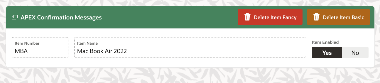
We have an Item page, and we want to give our users the ability to delete an item. To do this, we have added a Delete button which, when the page is submitted, deletes the item using a PL/SQL page process. To ensure that items are not accidentally deleted, we want to display a confirmation message to the user before the deletion. If the user confirms, we will proceed with the delete; if they cancel, we will not do the delete.
Basic Solution
The basics of Button Confirmation Dialogs are simple. All we need to do is flip on the button property Requires Confirmation for our delete button:
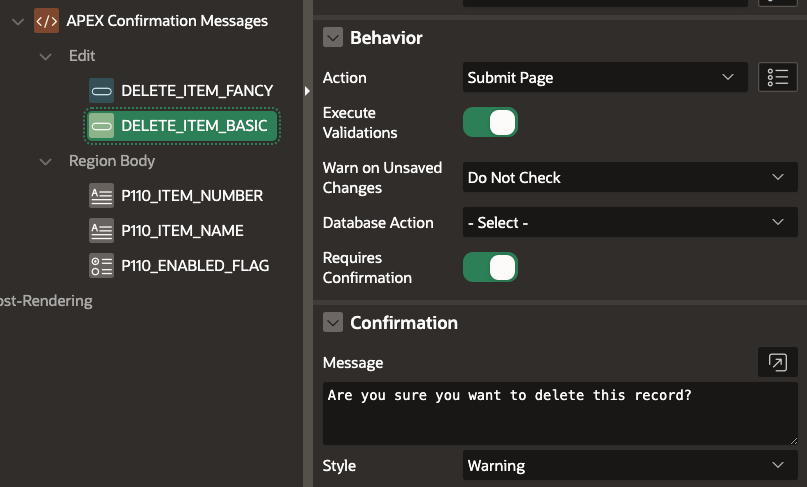
Requires Confirmationenables Confirmation functionality for the buttonConfirmation - Messageis the confirmation message we want to display to the userConfirmation - Styleis the style of the confirmation message [Default, Information, Warning, Danger, Success]. The style controls the color of the confirmation button, and the icon displayed to the user in the confirmation popup
Runtime
When the user clicks the 'Delete Item Basic' button at runtime, they are presented with a confirmation message. If the user clicks the confirm button, APEX performs the delete action; if they click Cancel, all processing is stopped.
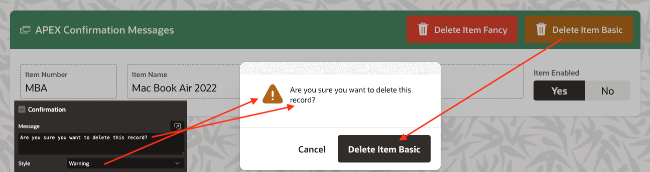
- The text in the confirmation button comes from the original button
- The message text comes from the
Confirmation - Messagesetting - The message icon comes from the
Confirmation - Style
Fancy Solution
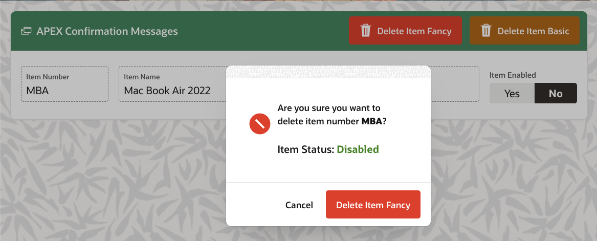
The basic functionality works great, but sometimes, to avoid mistakes, you need to emphasize the confirmation message. The Confirmation - Message field accepts HTML, so we can add HTML and CSS to style the content of the message as much as we want. But what if we could apply conditional logic, executed at runtime, to display a different confirmation message based on data on the APEX page? We can do this by using APEX Template Directives. For more on template directives, see my previous post Client-Side Formatting with APEX Template Directives.
Here is what the setup looks like when we apply Template Directive logic to the Confirmation - Message.
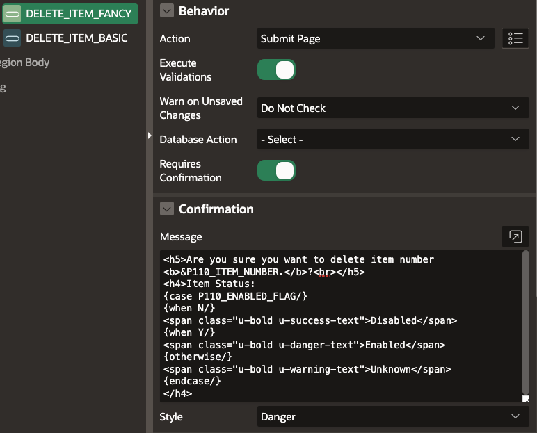
<h5>Are you sure you want to delete item number <b>&P110_ITEM_NUMBER.</b>?<br></h5>
<h4>Item Status:
{case P110_ENABLED_FLAG/}
{when N/}
<span class="u-bold u-success-text">Disabled</span>
{when Y/}
<span class="u-bold u-danger-text">Enabled</span>
{otherwise/}
<span class="u-bold u-warning-text">Unknown</span>
{endcase/}
</h4>
- The first line references the value of the page item
P110_ITEM_NUMBERto remind the user which item they are deleting. - The template directive
casestatement checks the value ofP110_ENABLED_FLAGand emits different CSS and HTML depending on whether the item is enabled or not
Runtime
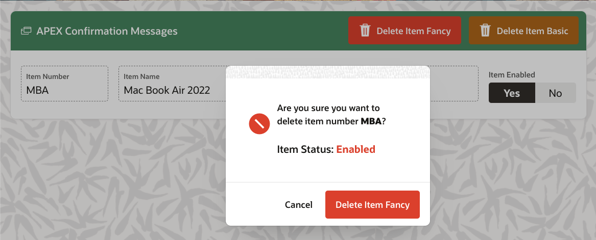
At runtime, when the user clicks the 'Delete Item Fancy' button, and the Item Enabled flag is set to Yes then the item status is highlighted in red to warn the user that the item is enabled:
If the item is disabled, then the item status is highlighted in green:
Dynamic Action Alert & Confirm Dialogs
Use Case
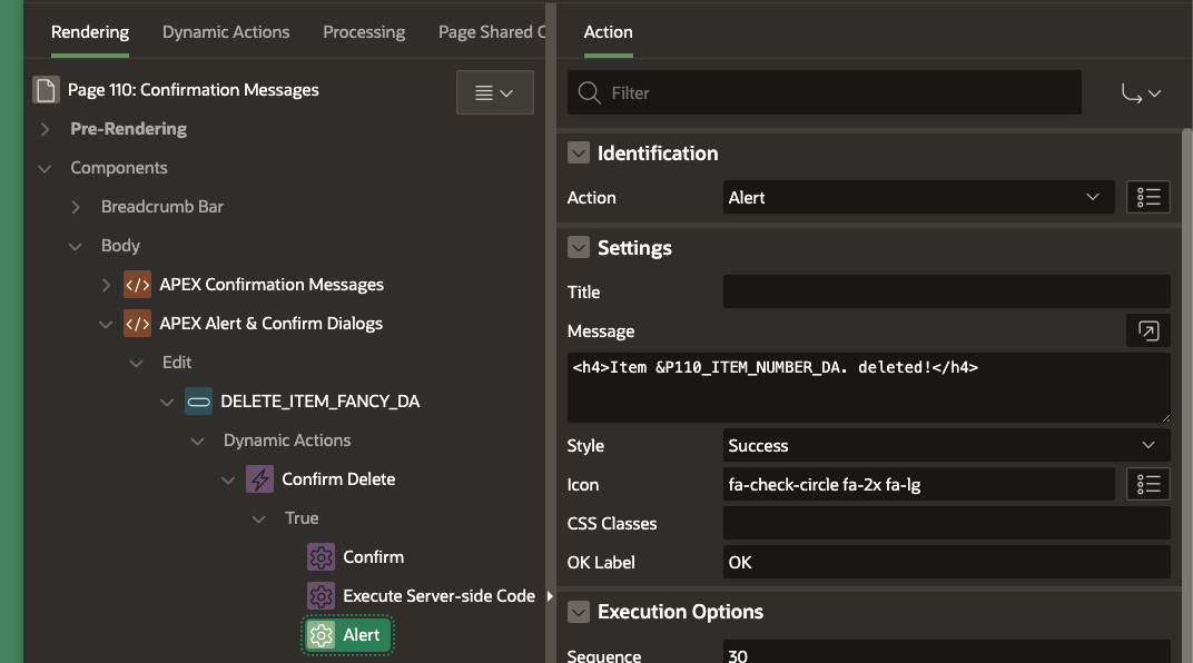
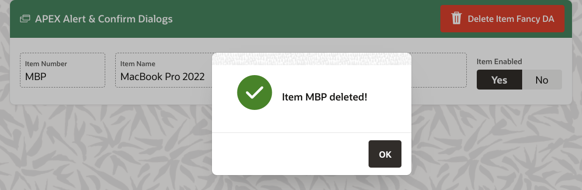
Continuing from our previous use case, we have decided to implement the item deletion as a Dynamic Action instead of a Page Process. Given this, we need to utilize a Confirm Dialog to get the user to confirm before deleting the item. After the item is deleted, we want to display an Alert Dialog confirming to the user that the item has been successfully deleted.
Solution
The configuration for the Confirm Dialog looks like this:
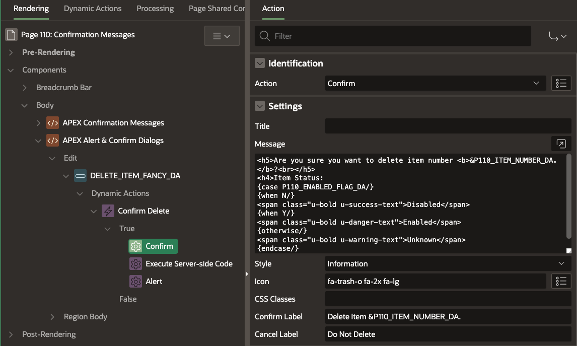 We get a little more control over what is displayed to the user in the dialog when compared to the Button Confirmation Dialog:
Titleis the title of the dialogMessageis the message we want to be displayed to the user. I have used the same Template DIrective logic used in the Fancy Button Confirmation Dialog example aboveStyleis the style of the confirmation message [Default, Information, Warning, Danger, Success]. This property controls the color of the icon defined belowIconis the icon displayed in the dialog. If you leave this empty a default button will be used based on theStyleyou selectedCSS Classesyou can add additional CSS classes here to style the dialog, e.g., use a different background color for the dialogConfirm Labelis the text that will be displayed for the confirm button labelCancel Labelis the text that will be displayed for the cancel button label
The configuration for the Alert Dialog is a little simpler:
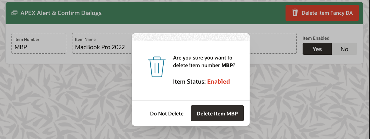
Runtime
At runtime, the Confirm Dialog looks like this (for an enabled item):
And the deletion complete Alert Dialog looks like this:
Conclusion
While not earth-shattering in the functionality they provide, Alert and Confirmation dialogs simplify a developer's day-to-date life, reduce bugs, and provide a more consistent UI. This is achieved by reducing the amount of custom code.
🔗 Read More
- 🩳 APEX Shorts
- #️⃣ APEX Posts